A focused foundation
Responsive layout audit or brief, agreed against the real tasks your business needs to complete.

Plan a website layout that remains readable and usable across phones, tablets and larger screens. ADSHOOT DIGITAL MEDIA helps turn your requirements into a reviewable scope, a considered build and a practical handover.
A written scope. Clear responsibilities. Work built around your goals.
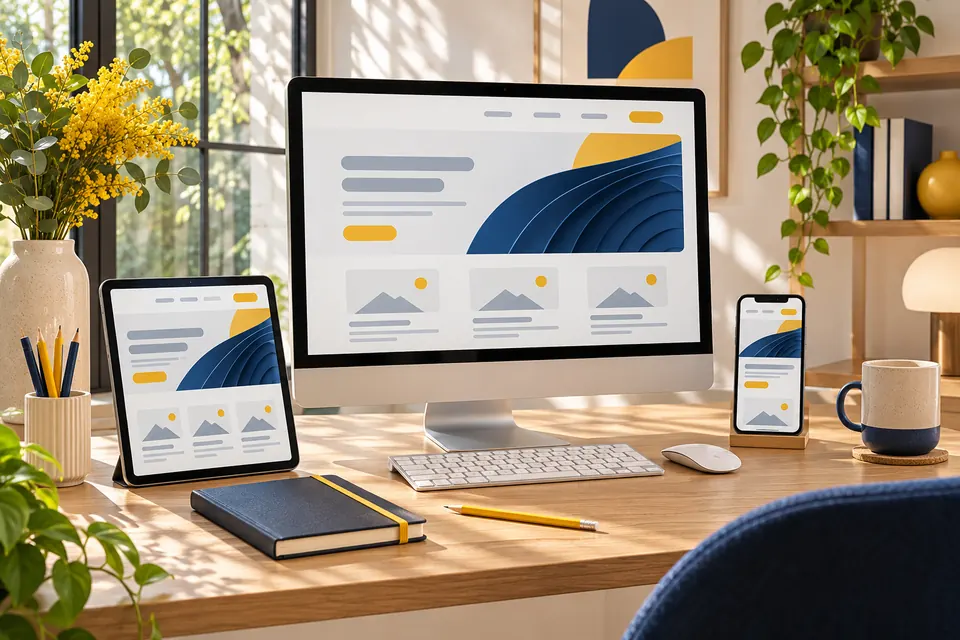
Shrinking a desktop page can leave tiny controls, awkward forms and overflowing content. We review how information and interactions should adapt at different widths.
The design sets responsive behaviour for navigation, typography, images, grids and forms. Testing includes long headings, validation messages, keyboard focus and touch targets on representative viewports, with fixes prioritised around essential journeys.
Responsive layout audit or brief, agreed against the real tasks your business needs to complete.
Adaptive navigation and form layouts, with the important states and exceptions discussed before delivery.
Implementation notes and retest results, so your team understands the agreed setup and its responsibilities.
We agree the relevant deliverables for your project before starting.
We begin with responsive layout audit or brief. The review identifies the priority users, current constraints and the business decisions needed to agree a practical first phase.
We develop mobile and desktop page patterns and plan adaptive navigation and form layouts. You can review the proposed structure before the work moves into implementation.
We implement the approved scope in reviewable stages. Feedback is checked against the brief, and new requirements are estimated before they change the agreed work.
We review the key journeys and outstanding issues together, record the accepted deliverables and explain the access, files and operational steps included in the handover.
We estimate milestones after reviewing mobile responsive website design requirements and the existing setup. Coverage is defined by an agreed device and browser matrix, not every device ever released. Feedback rounds, content readiness and external approvals can change the schedule; we agree these dependencies before starting.
Fees are based on the agreed templates, features, integrations and review rounds. The written proposal separates implementation work from hosting, subscriptions, paid assets and ongoing support. Additional functionality is quoted before work proceeds; sending an enquiry does not commit you to a purchase.
Request a tailored scopeMobile Responsive Website Design from ADSHOOT DIGITAL MEDIA. We review your business goals, agree on scope, define deliverables and provide clear communication throughout the project. Get in touch for a tailored quotation and timeline.
More detail about Mobile Responsive Website Design and how we work together.
We can audit the existing code and identify reusable elements. Some layouts need targeted CSS changes, while older themes or inflexible components may require a broader rebuild.
The scope can include responsive layout audit or brief, mobile and desktop page patterns, adaptive navigation and form layouts, responsive image sizing, agreed browser and viewport checks, and implementation notes and retest results. Your proposal confirms the exact deliverables and exclusions for your project.
Coverage is defined by an agreed device and browser matrix, not every device ever released. Existing third-party embeds and legacy components may need replacement if they cannot adapt reliably.
We provide the agreed handover files, access guidance and known limitations. Ongoing updates, new functionality and support availability are defined in a separate maintenance scope or the support terms of your proposal.
Tell us what you need from Mobile Responsive Website Design. We’ll review your requirements and follow up with the next step.
Submitting an enquiry does not place an order or commit you to a fee.
View our contact details